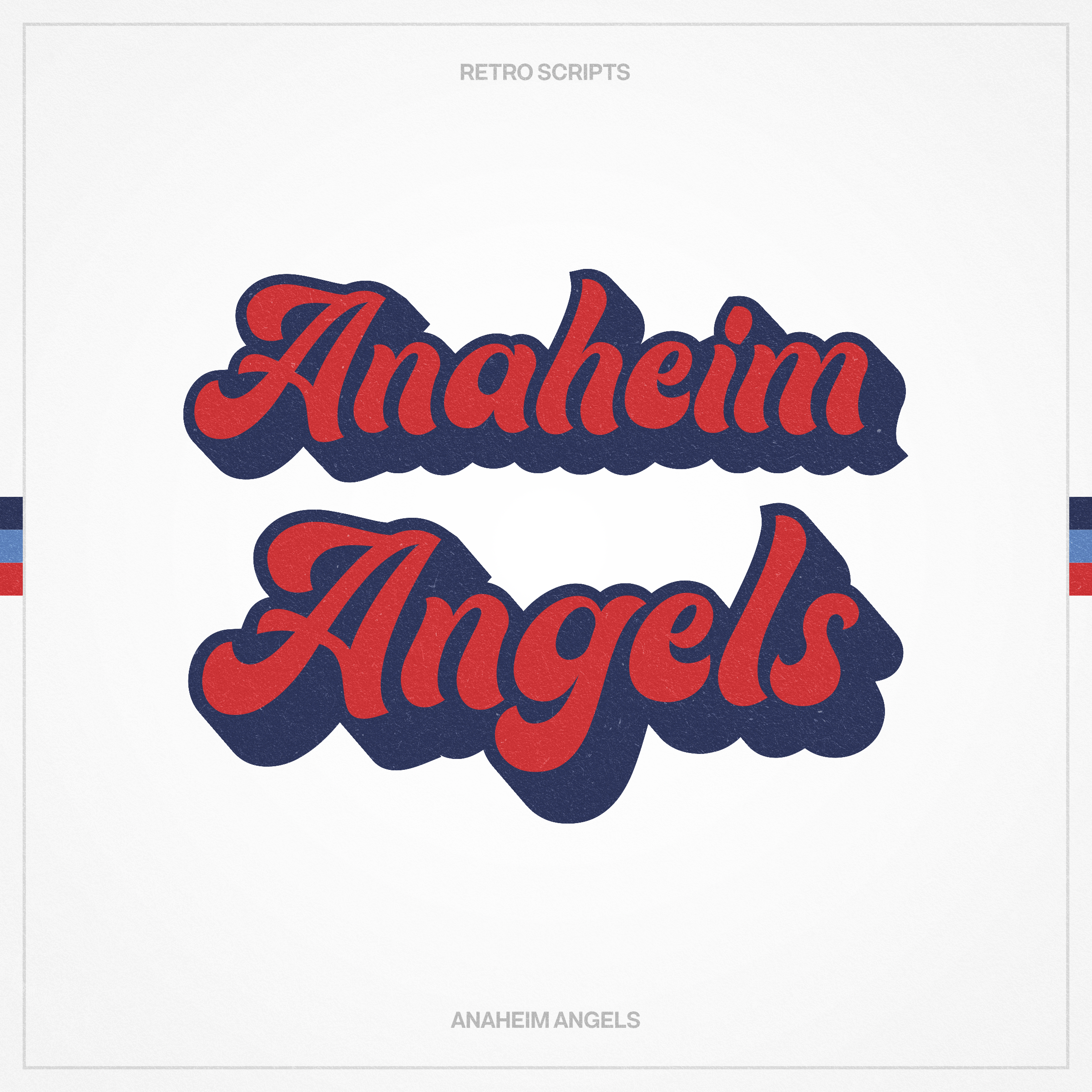
The current Angels brand isn’t bad but I’ve always felt they could do more with the identity. My first order of business was dropping “Los Angeles” in favour of “Anaheim,” which differentiates them from the Dodgers and gives them a stronger location identity.
Previous
Previous
Rebrand • Houston Rockets
Next
Next


